Report-Level Text
Reports can contain a lot of features that aren’t obvious at first glance or at all. Don’t make your audience wonder how to use your report. Design your reports with tips and information that enable your audience to dig into the data without stumbling.
Use the first page in the report to give your audience the basics. Two popular approaches to consider are the table of contents page and the introduction page.
A Table of Contents Page
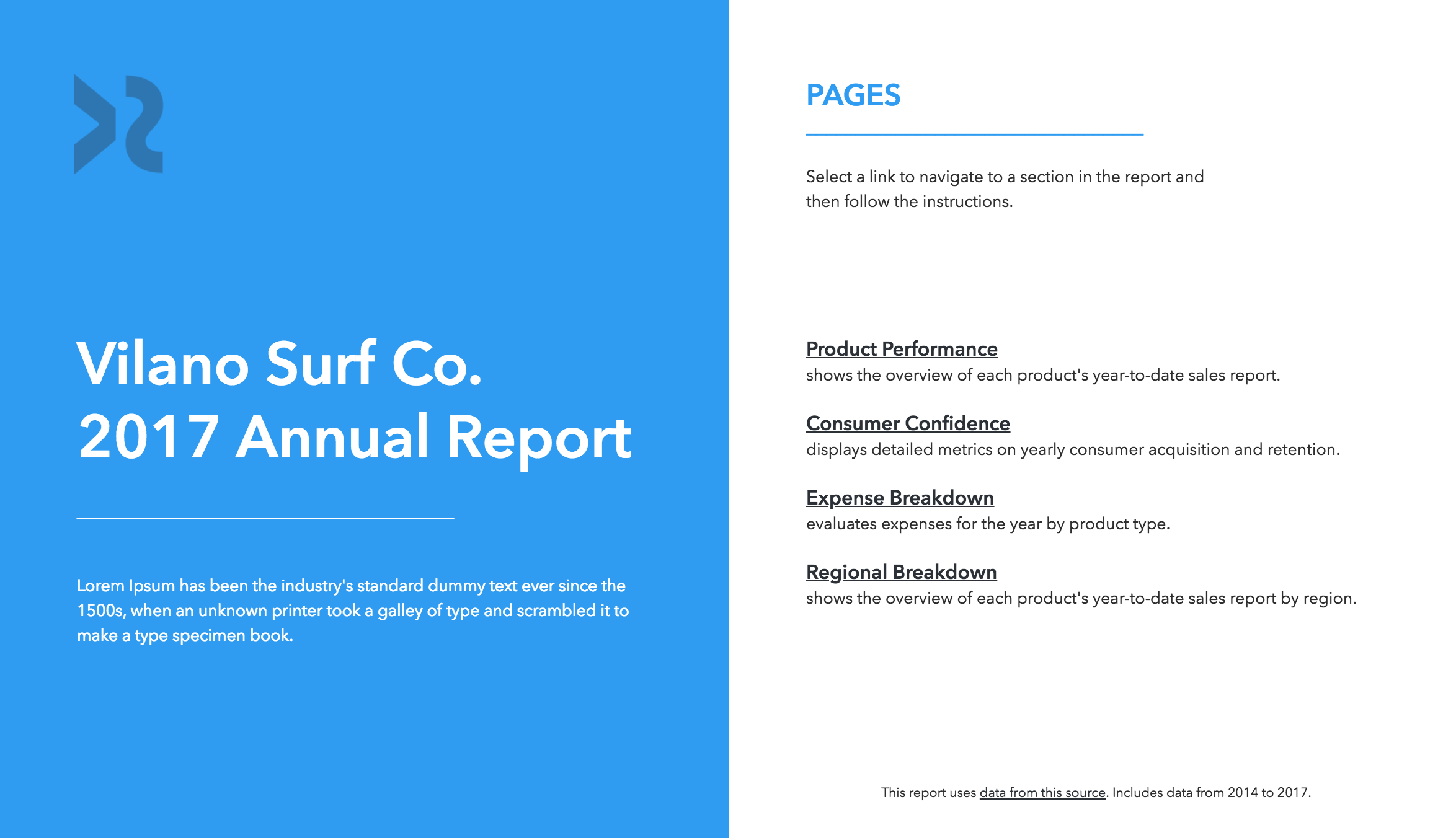
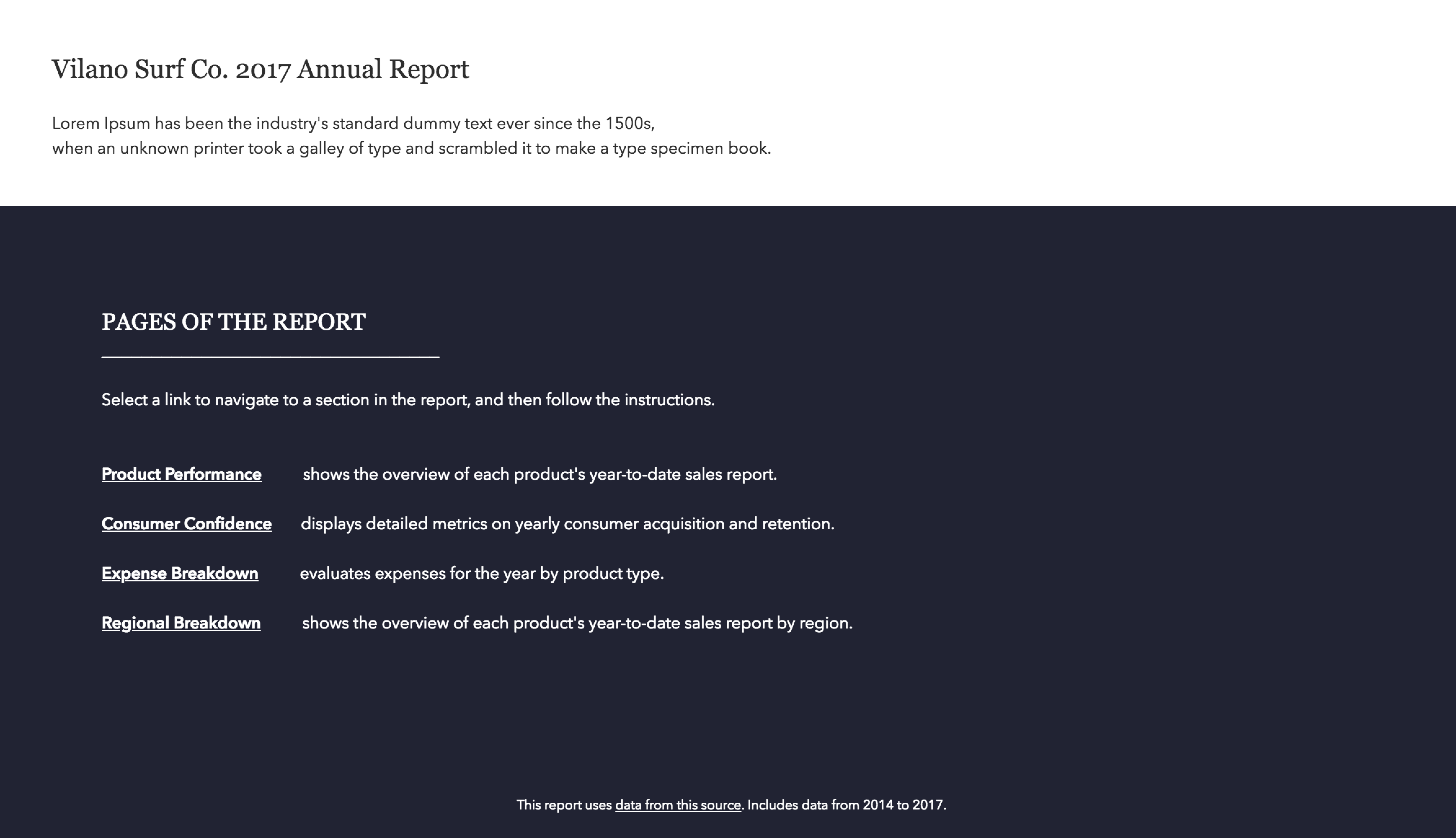
The first page can be a table of contents. By providing a clear and descriptive link to each page in the report, your audience can quickly understand what’s available in the report and jump to the page that they need right away.

Examples of Table of Contents Page Designs
An Introduction Page
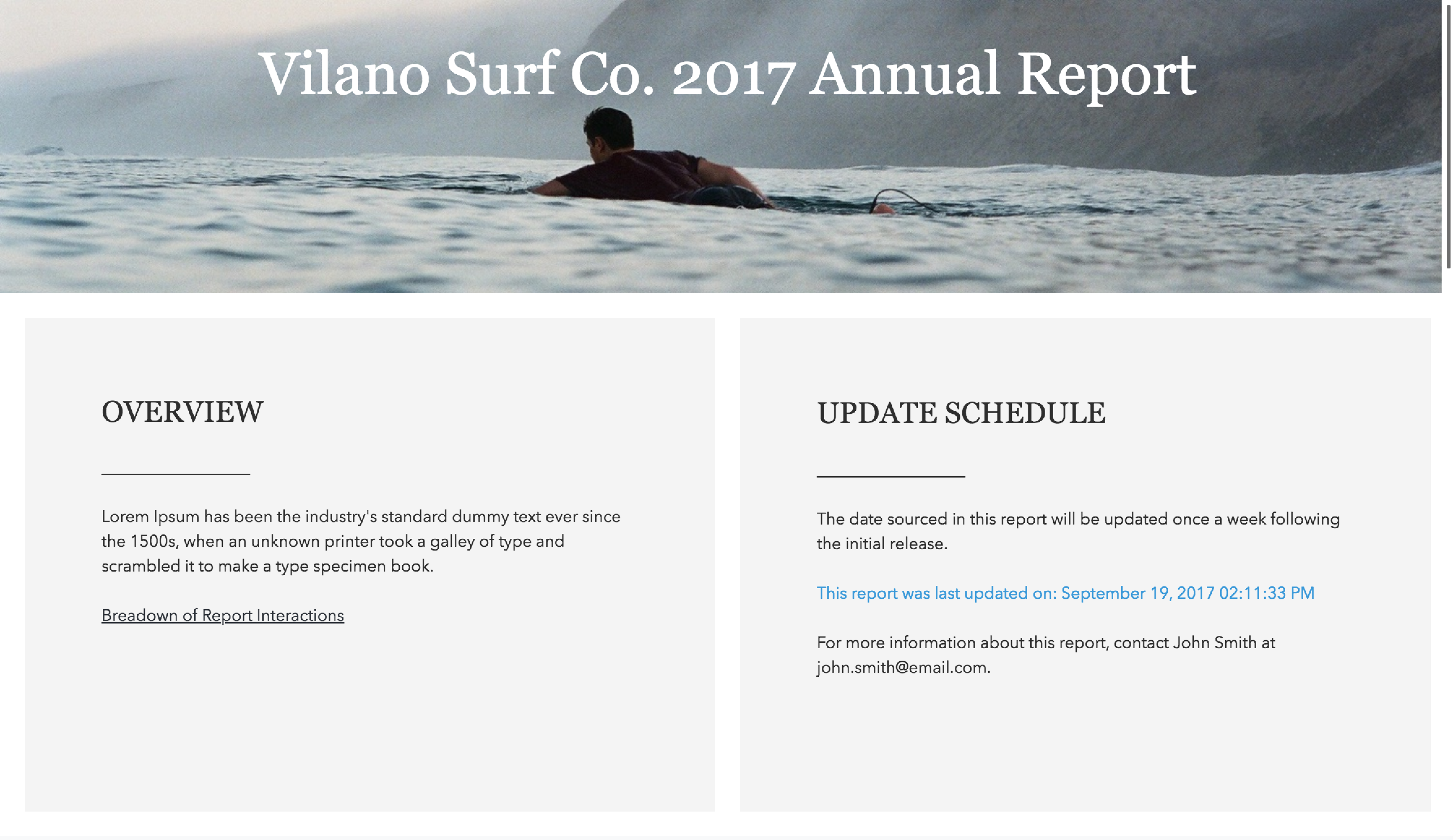
The first page can be an introduction about how to use the report. It can be a maintenance statement that alerts the audience about the update schedule. It can provide contact information for the system administrator or report designer. If your organization requires its logo in the report, the first page is a good place to put the logo so it doesn’t get in the way of charts and graphs.

Examples of Introduction Page Designs


Guides and Background Information
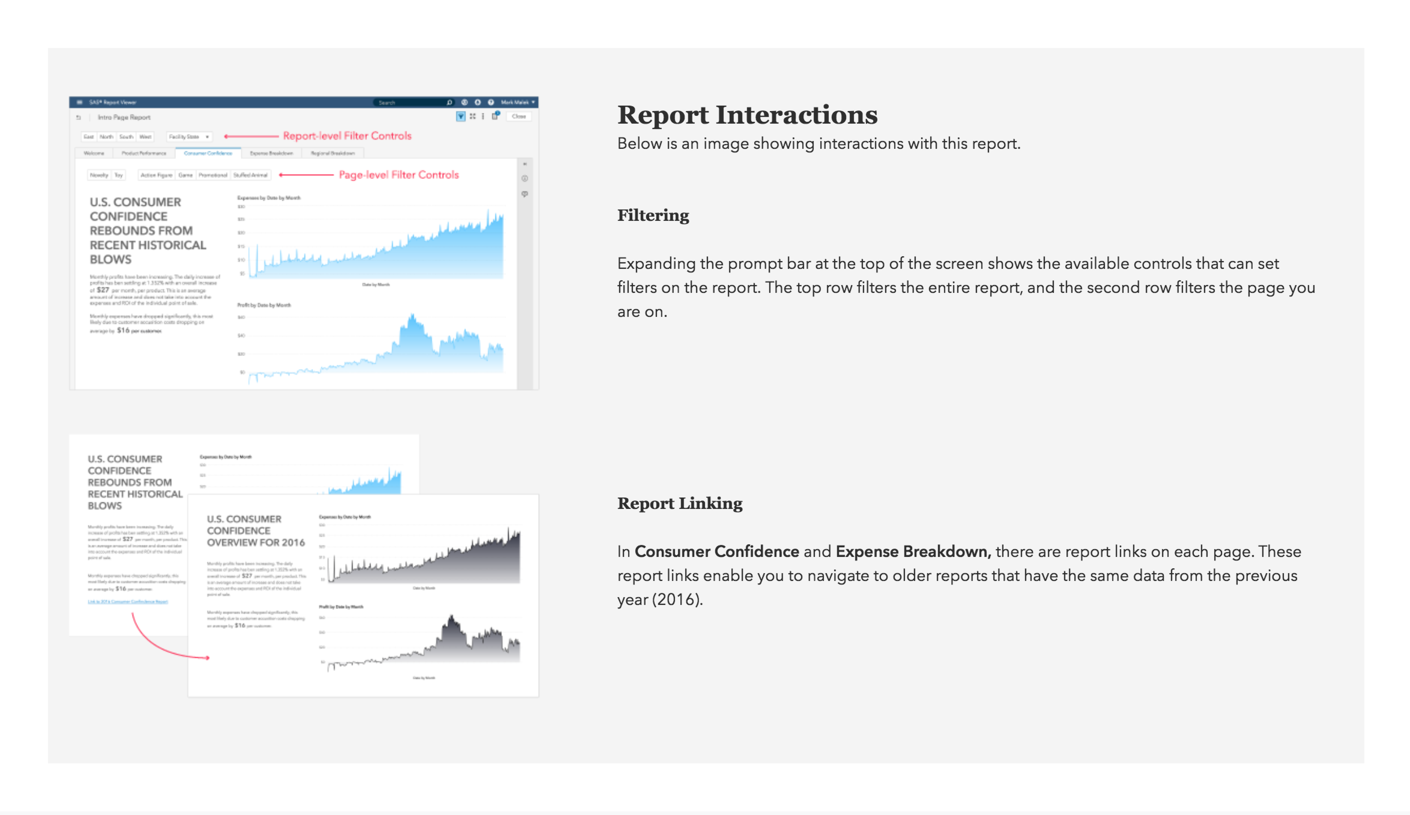
Sometimes, a page can benefit from detailed tips or background information. Hidden pages are a great way to provide more information without creating clutter. For example, a hidden page in your report can contain detailed tips about how to use the report or the report objects on a page. Hidden pages can be especially useful to inform your audience about filtered links on the page that open other pages or reports. Not only can you let them know about available links and features, you can describe how the links or features work so that your audience is not caught off guard. For example, you can alert your audience that a link opens another report that might not be available for everyone in your audience.
